Monika Gause is a graphic designer, tech writer, trainer, Illustrator nerd and Adobe Community Professional. She created a family of color fonts for one of her professional projects & shares about her experience with Fontself Maker, an extension that brings font creation features to Adobe Illustrator.
This article is a follow-on part (Part 1 covers the creation of color lettering in Illustrator). This Part 2 focusses on how to turn color vector shapes into OpenType-SVG fonts with Fontself.
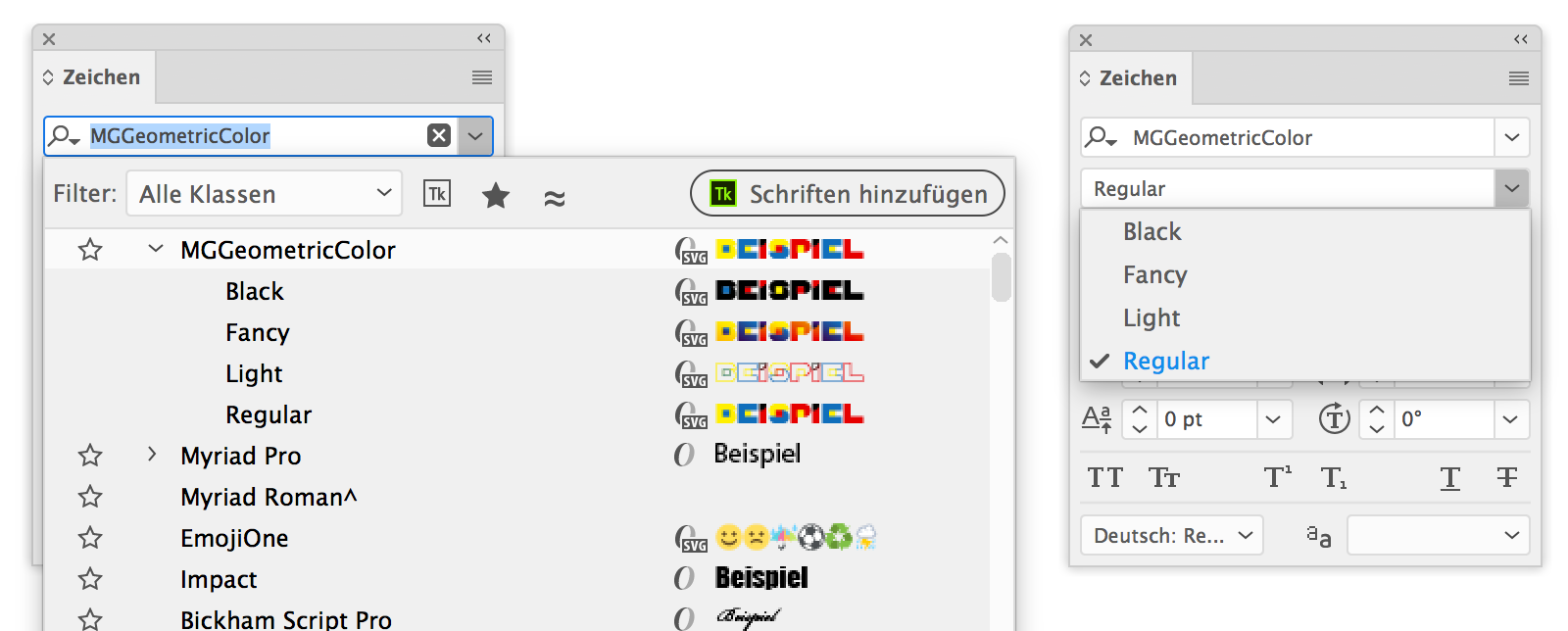
Preparing for Fontself
First thing to do at this stage is to get rid of any invisible leftovers from Pathfinder operations. To do this you create a new object, fill and stroke it with None and then go to Select > Same > Fill & Stroke. Delete the objects.
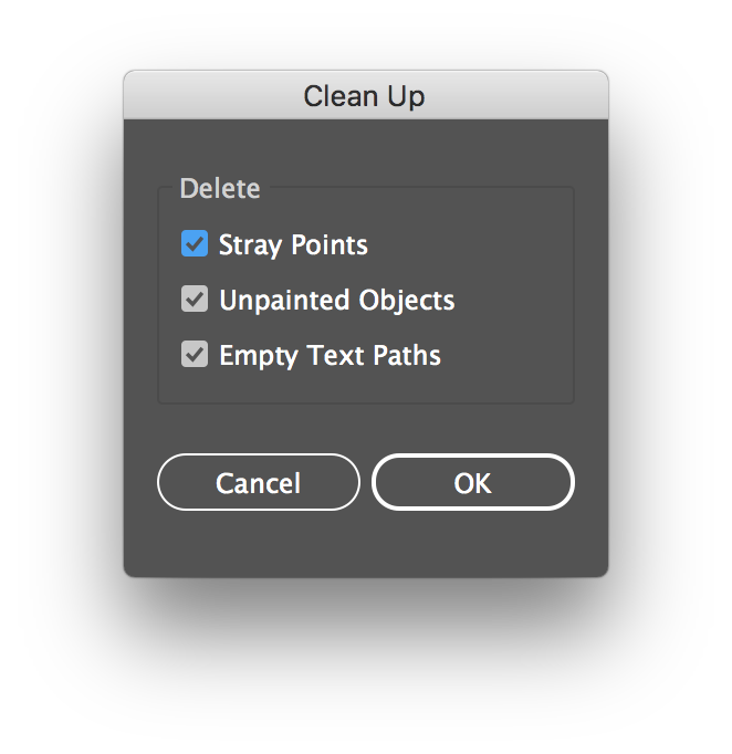
You could also use Object > Path > Clean Up and then the option Unpainted objects for this, but when you first select them, you can still check if there are objects selected that you would rather keep, such as helper objects.
Now you need to make sure that the objects that belong to each letter are grouped. In case they all have the same color, you can also create a compound path. You can select each letter by dragging a selection rectangle around it with the select tool. Then check if it is already a group (it will be named Group in the top left of the control panel or at the top of the Properties panel). If it’s not a group, group it.
In case all your letters have overlapping objects, e.g. when you’re designing icons that all have a base shape, then you can use the script GroupOverlappingObjects. Download it from https:/www.wundes.com/JS4AI/. You can then select all your objects and run the script on them. It will create a group for each of the icons. I could select all those icons at once and group them each by running the script.
Making the base font
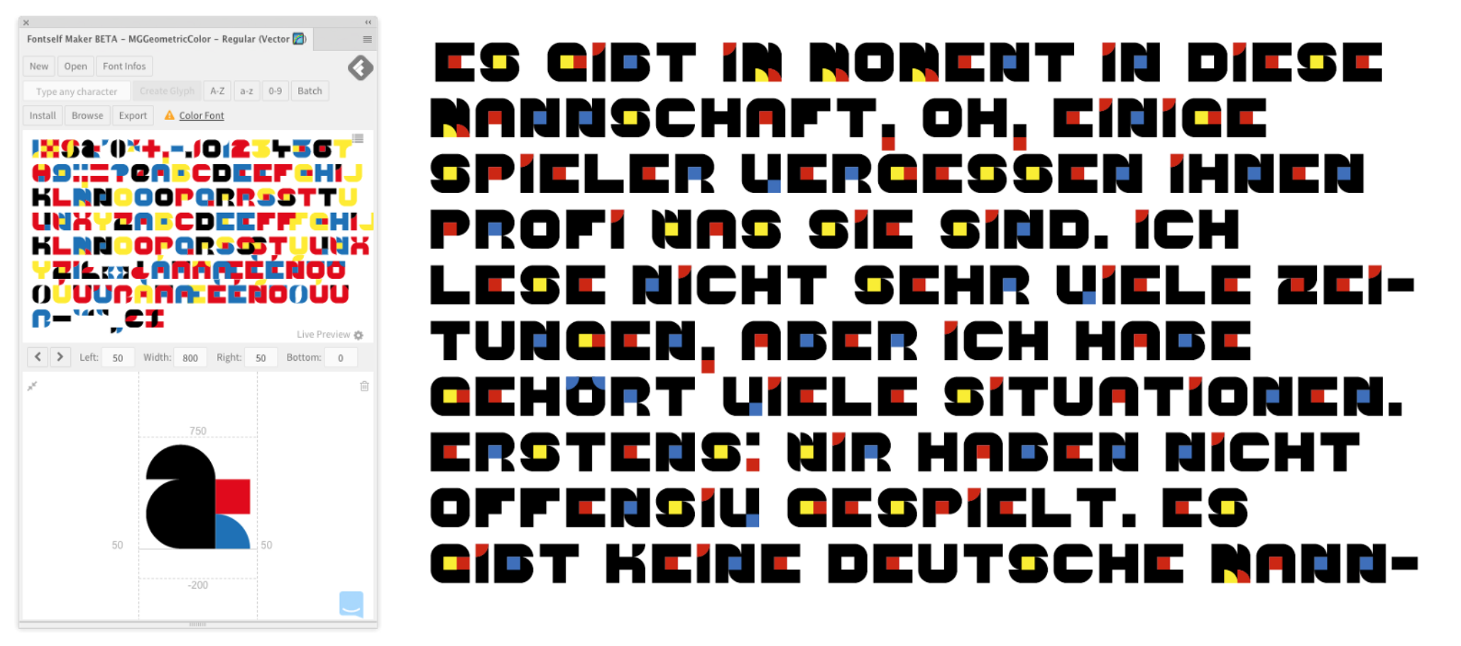
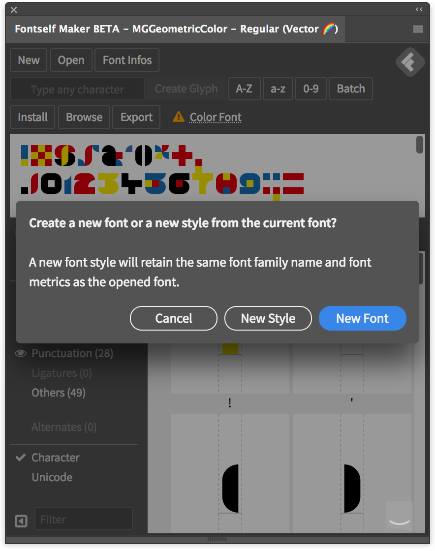
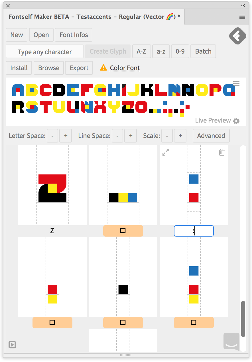
We now create the actual font. Open the Fontself panel in Window > Extensions > Fontself Maker if you haven’t already. In case you already made some tests in Fontself, create a new font by clicking on New. When asked, choose if you want to have a completely new font or just a new style.
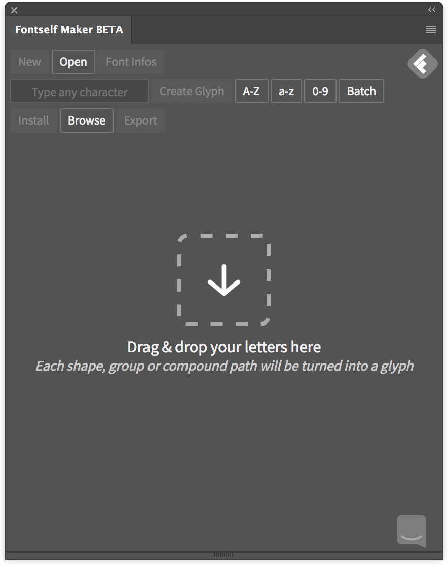
Fontself is then ready to import your shapes.
When all of the letter shapes are aligned on the baseline (which also works when there are multiple baseline guides in your file), you can run some automation in Fontself.
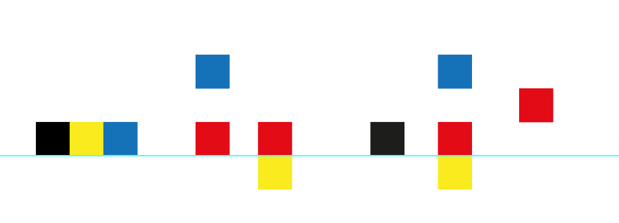
In order to import the base A to Z, a to z or 0 to 9, select those shapes (they have to be aligned on the base line and in the correct order) and drag them into the Fontself panel. Fontself will then show four buttons and you have to release your shapes on the corresponding button.
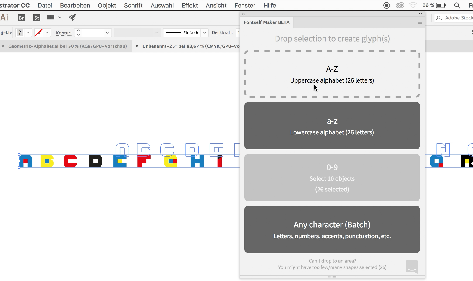
That’s it. If all your letters have been correctly grouped in the correct order, you will find them in the corresponding slots in the panel. The correct alignment happens automatically, because all letters are inside the grid and therefore align on the baseline.
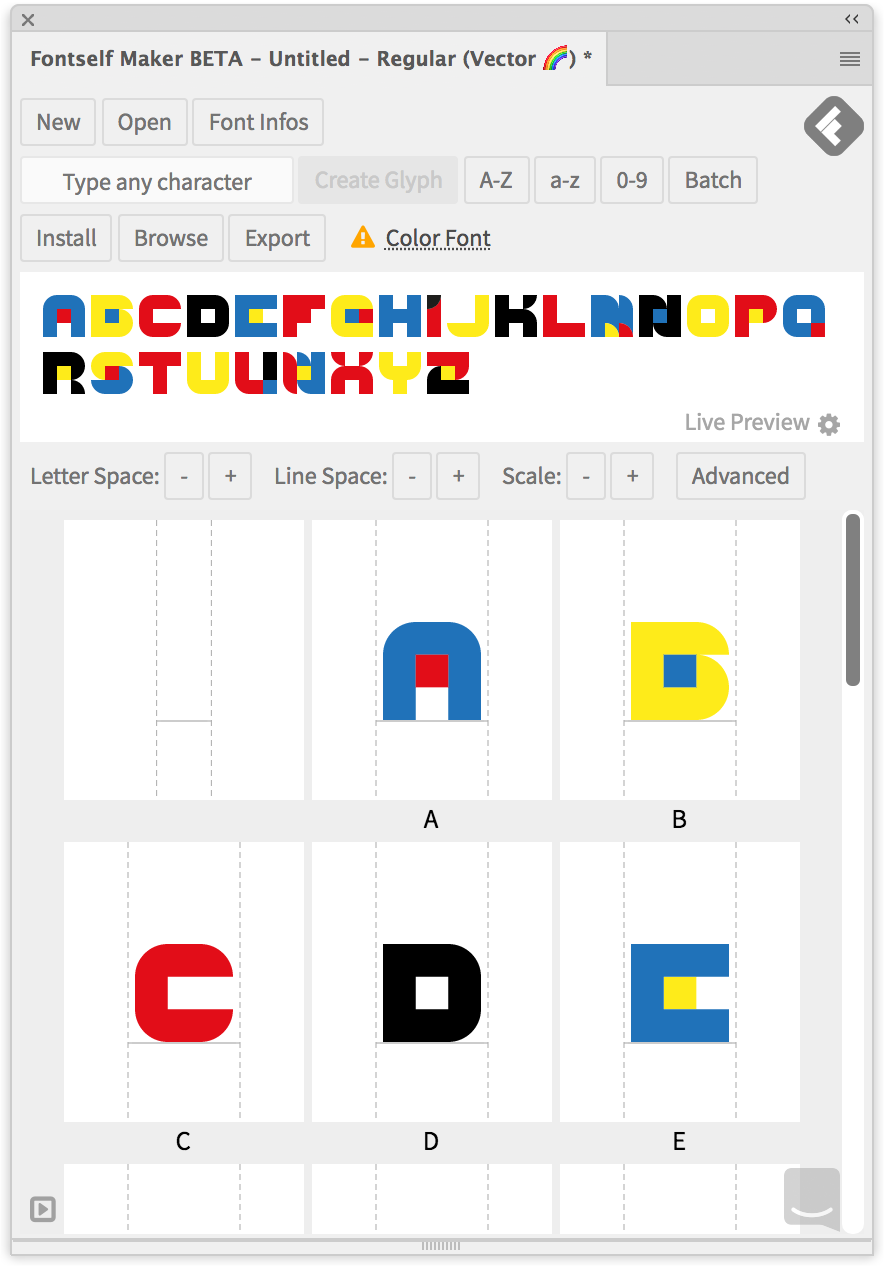
The same goes for the letters a to z and 0 to 9.
If you have a range of random characters, you can use the button Any Character (Batch). Drag the shapes onto that character to just import them with their correct geometry aligned on the baseline. You can then revisit them one by one in the Fontself panel to assign letters to them.
Power tip: to speed up the process for accented characters and punctuation signs, you can also rename each Illustrator object with the exact character you want, then Batch import them. No need to rename them, Fontself will automatically assign each object name to each character key.
Making alternates
I wanted to have alternatives in my font in order to be able to showcase this Illustrator feature. To create them in Fontself is quite easy, you might even stumble on this by accident when you try to create a letter that is already there. You select the shape on the artboard, then enter the letter in the Fontself panel and click on Create Glyph.
Fontself will then ask you if you want to Replace the existing glyph or create an Alternate (or cancel). That’s it. Click on Alternate and you’re done. I created alternates for some of the most widely used letters, so that one color doesn’t get too dominant in a text.
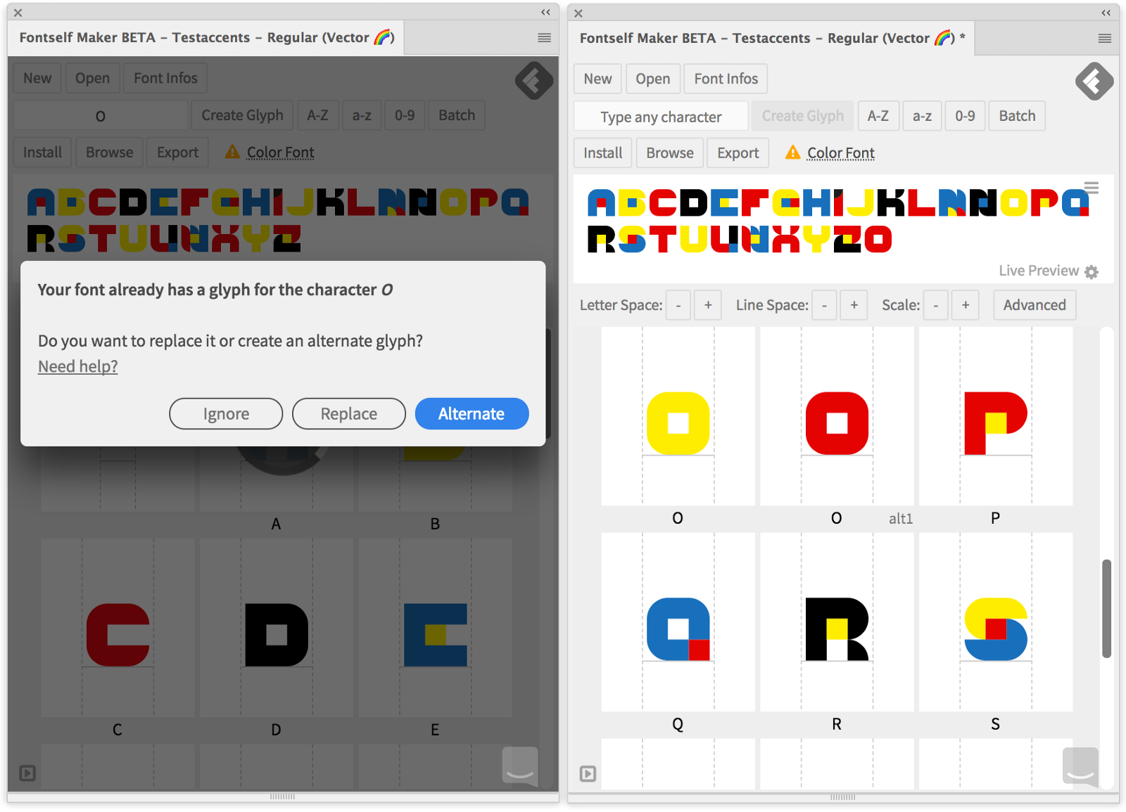
The alternates are marked as »alt 1«, »alt 2« etc. in the Fontself panel. Alternates will be shown in Illustrator as a popup panel when you select a letter in your text that has them assigned in the font.
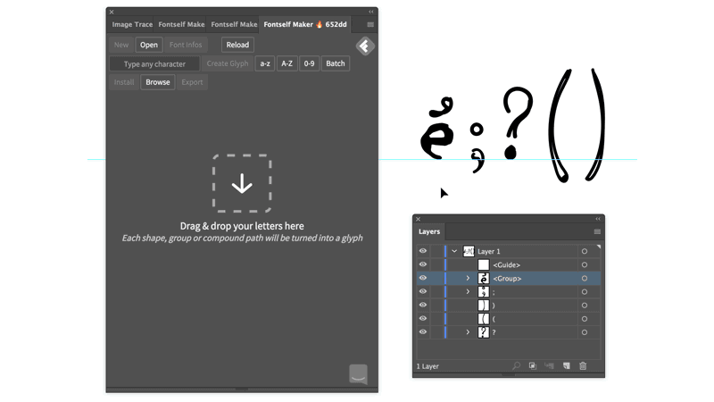
Making punctuation
Punctuation in the case of my font was a little more difficult, because the glyphs don’t align on the baseline by themselves. Parts of them reach below the baseline. Some punctuation marks — such as apostrophes — are positioned some gridlines above the baseline.
I aligned the punctuation in relation to the other letters and guide called »baseline«. Fontself recognizes that guide. Then selected all of the shapes as well as the guide and dragged them onto the button Any character (batch). I then revisited each of the slots Fontself created to assign a letter. Just select the placeholder and type the letter you want.
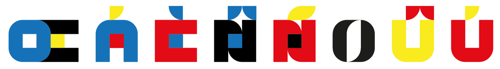
Enter the ẞ
The basic alphabet is nice, but for German not quite enough, since we have all of these crazy characters in our language and it always disappoints me when they are not there in a font that I like and want to use. So I wanted to have them. They can easily be built with Fontself, but the ß this year got an uppercase version approved by the Council that decides on German Orthography.
It doesn’t really matter, since uppercase and lowercase look the same in my font, but it will throw off Illustrator when typesetting, so I wanted to have it as well. When typing a letter the font doesn’t have, Illustrator will switch to the default font and stay there.

Getting letters like this into Fontself works awesome as well since you can copy them from somewhere and just paste them into the letter field and then add your design.
I created some other accented characters. For the German ä, ö and ü I tried to stay inside the initial grid, but for most of the other accents this didn’t work so I added a line to the grid to use for the accents. As you can see I tried out the points with concave and convex arcs — I decided to use the convex ones.

The accents borrow their shapes from punctuation marks. This worked like using building blocks. I took what I already had, rotated it if needed and aligned it on the letters. The font uses a limited set of shapes that all fit into a square grid, so this works perfectly. Symmetrical accents like the circumflex accent would not fit well into the three by three grid, but instead of just centering them on the letter I decided to align them asymmetrically.
Signs, Symbols & model trains
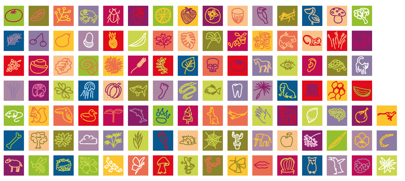
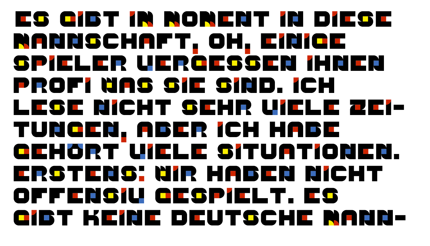
To make a font real useful you have to have some symbols like the ampersand, mathematical signs, a star (to point to the fine print) and of course a hashtag, the €, $, £ and ¥. I made a lot of these with friends in mind, as they live in these countries or like specific symbols a lot. Building a font is like building a model railway: you can go on forever (OpenType fonts allow for thousands of glyphs).
My grid is too strict for the more delicate shapes, so I had to stop at some time. I also didn’t have the time to spend more weeks or months on this. I had my fun and I have a font that I can distribute. Let’s move on to the next task such as writing a tutorial about the process.
Letter spacing and kerning
A geometric font like this doesn’t need too much adjusting, but if you need it for your project, it’s pretty straightforward to adjust it in Fontself. You can adjust the general spacing for all the letters at once, the scaling and the line height directly in the default view of the Fontself panel. Just use the + and — buttons directly below the character view.

In order to change this for individual letters, click on Advanced in the Fontself panel. By default it goes into the spacing adjustment. You can view it in different modes. Use the small panel to change between them.
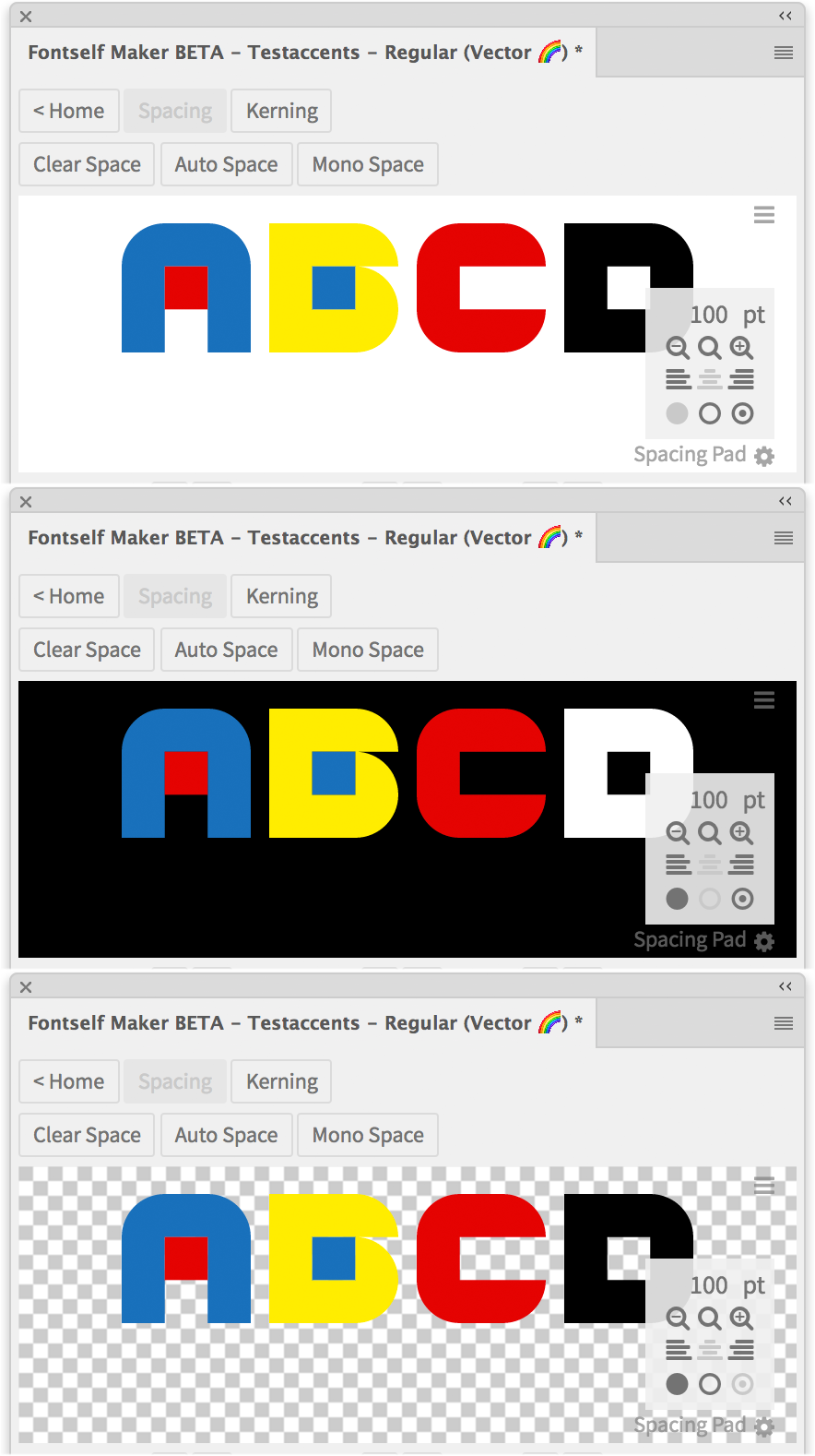
Delete the letters that are present there and type the ones you want to adjust. Then select a letter and just drag it to adjust its spacing. You can also use the arrow keys to move it. You can then watch the spacing and width values change in the highlighted fields.

In order to create kerning pairs, go to Kerning by clicking on the button in the top button row. There you can again type the letters you want to adjust and then drag the dashed line between them in order to get them closer together or farther apart.
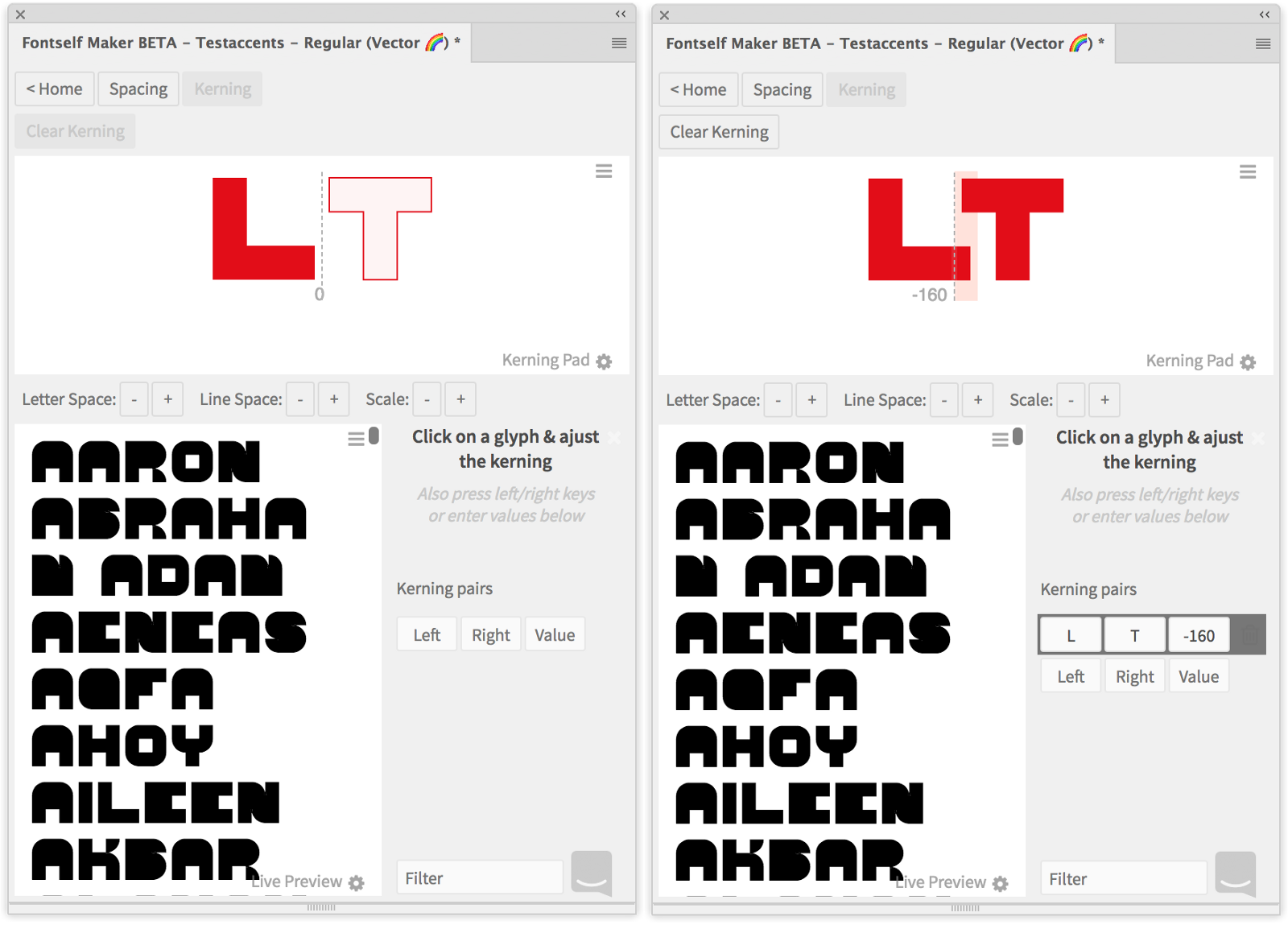
A kerning pair gets created and you can see its values.
Ligatures
Not all letter spacing needs can be met by adjusting letter spacing and kerning. For some I created ligatures. Most of the ligatures of course could fit in the width of the initial grid, I had to use more than just three columns. But I had at least parts of the letters overlap in the ligatures.

The IJ
While I was still not finished with the font, I was on holiday in Belgium and the Netherlands. One of the characteristics in their spelling is the ij. It’s the ending of a lot of words and it even is a word in itself, as you can see on maps of Amsterdam. https://en.wikipedia.org/wiki/IJ_(Amsterdam)
There’s a lot of Art Deco and constructivist lettering and I love the ligatures they have made for the ij. So I included one of those in Geometric as well. Isn’t this lettering beautiful?
Creating different faces
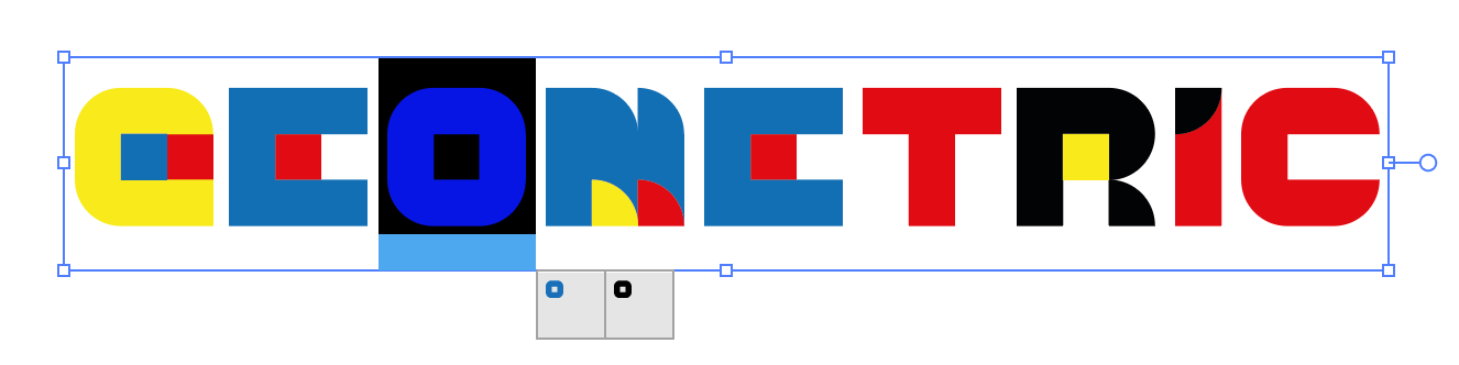
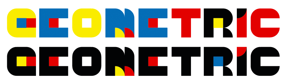
The base face of course sticks to the Bauhaus theme and uses the colors red, blue, yellow and black. I varied them in the letter shapes and had the letters use different base colors, that I then accented with the other colors.
Black face
I know that my use of the terms black and light is technically wrong. I wanted to be a little playful and tongue-in-cheek. Making a real lighter or fatter version will take some time to make, but a version that is just slightly reduced in color and an outline version were easy.
I changed the colors in the final lettershapes. For the black version this led to some additional changes of colors. The biggest shape of each letter needed to be black and I then had to switch colors in the other shapes as well to keep the coloring interesting and keep all of the colors in use in some of the letters.
Gradient face
Taking a closer look at other color fonts I noticed that you can also do gradients. So of course I wanted it as well, if only to explore the feature’s capabilities. I used the Regular style as the base for my Fancy style and first set up the colors of the gradients and then created swatches for the four gradients. Then for each letter I could exchange the flat color for the gradient and then adjust the gradient angle with Illustrators gradient tool. All those gradients are slightly angled and reach in the direction from the bottom left to the top right of the letter. This adds depth to the letters’ shapes. It’s my favorite style.

In order to make a new face for a font family, you click on New and then on New Style. Creating the new style is important, because then your family is grouped in the font menu with the styles as items on the submenu.
Some remarks on strokes
When turning this into an outlined version I had to decide which color to put in front when there were neighboring ones. This was a process of trial and error. In the end I did not only move objects to the front or back, but trimmed the lines so that there were no duplicate lines of different color stacked on top of each other, because it might look bad because of anti-aliasing (you can see that in the center version of the W with its tiny black edges along the yellow).

For the first run of the outline I cheated and just applied the fill to the stroke of the shape and then dragged the shapes into Fontself. Of course this caused uneven lettershapes and the different faces could not be combined in one design. So I needed to invest some more time. Fortunately I got away with just making the shapes slightly smaller.

Scaling of Outline face
The outline is rather thin, so you can’t scale this font too small without getting in trouble with your output, but this is a display font, it won’t be used for the fine print anyway.
How to prepare strokes for Fontself
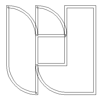
Fontself does a good job of converting strokes, but if you’re doing this yourself, you will need to optimize the outlined strokes as well. Outlined strokes might be self overlapping or when creating them from different shapes of the same color that just overlap. When this happens inside a font, users of the font might get surprising results.
So what you need to do after outlining strokes is to check them in outline view. These two shapes are both blue and should therefore be merged. You can select them and then use the Pathfinder > Unite to do it.
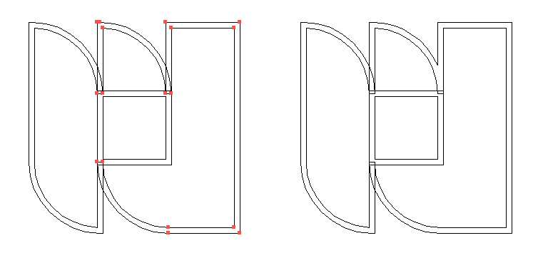
In case you outline strokes using the Flatten transparency you will get self-overlapping shapes. These can also be optimized using the Pathfinder > Unite.
As you see, it’s pretty simple and straightforward to create your own font. Just go for it and create your own very personal font — it’s never been easier. And in case you like mine, you can download it from my Behance page for free.
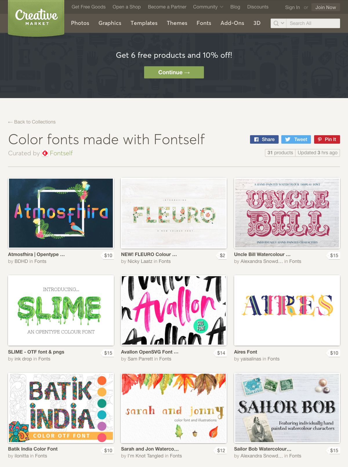
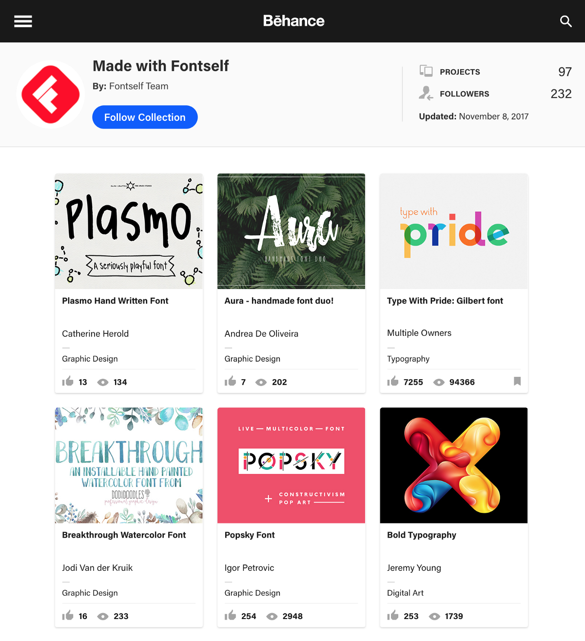
Got inspired by this tutorial? Now how about creating your own color fonts? Check what other Fontself users have made on Creative Market or Behance.